Classic · 15cm
Classic · 15cm
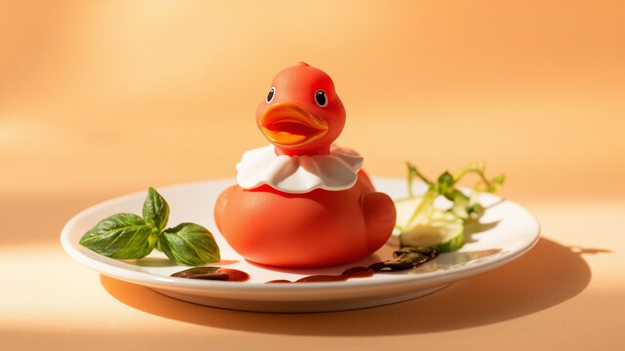
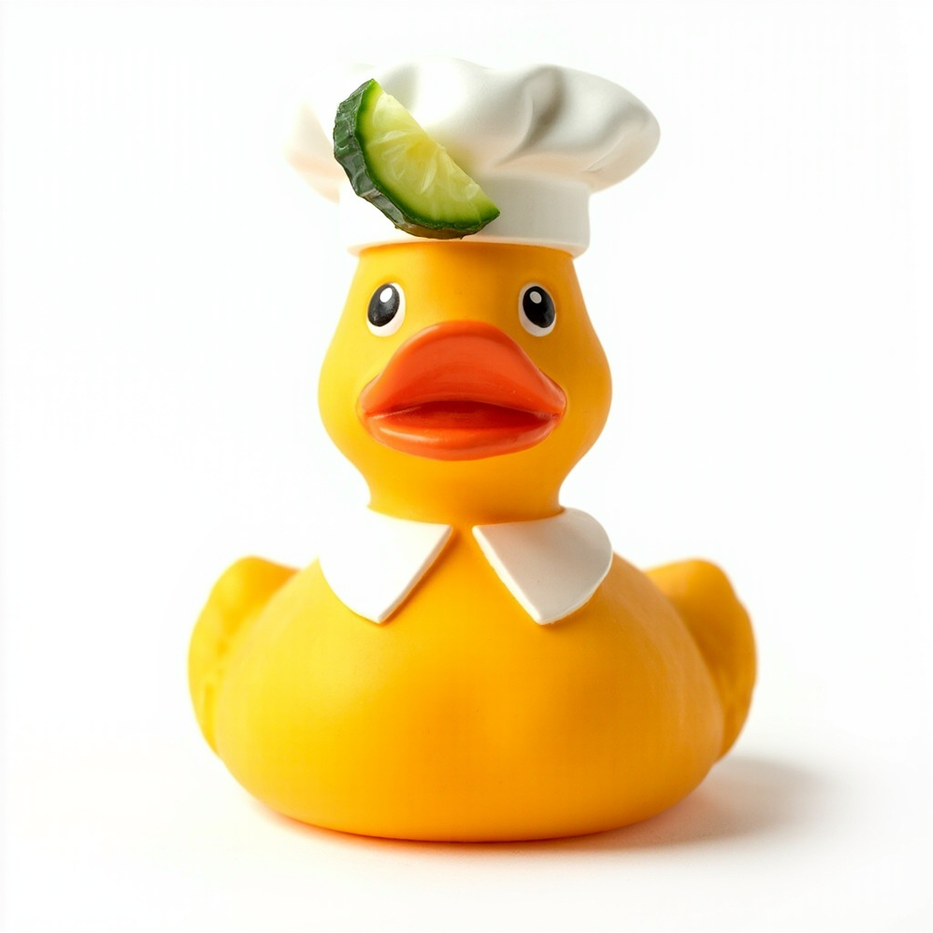
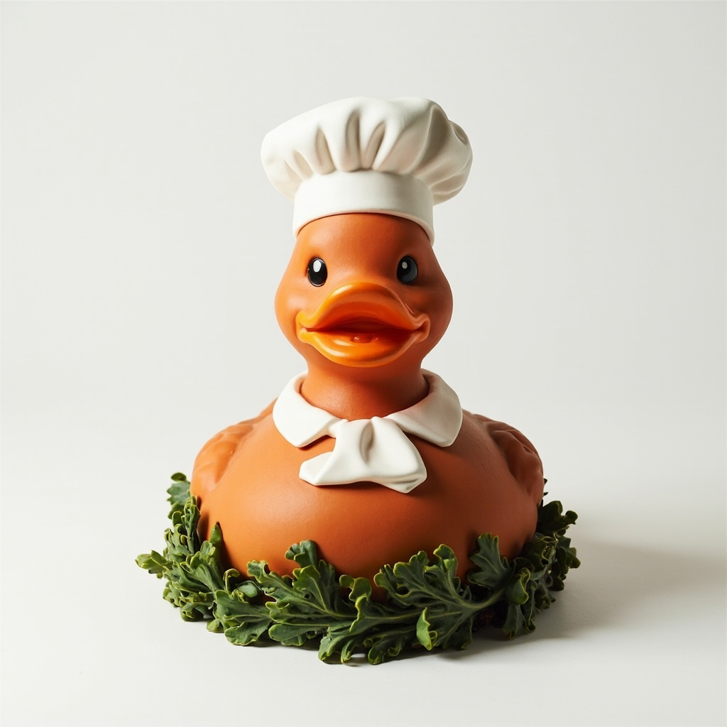
Our house staple: an egg-yolk-orange duck finished in matte glaze, served with a hand-painted chef's collar and a cucumber-slice cap. The kitchen's most-photographed guest.
€ 48.00
Our house staple: an egg-yolk-orange duck finished in matte glaze, served with a hand-painted chef's collar and a cucumber-slice cap. The kitchen's most-photographed guest.
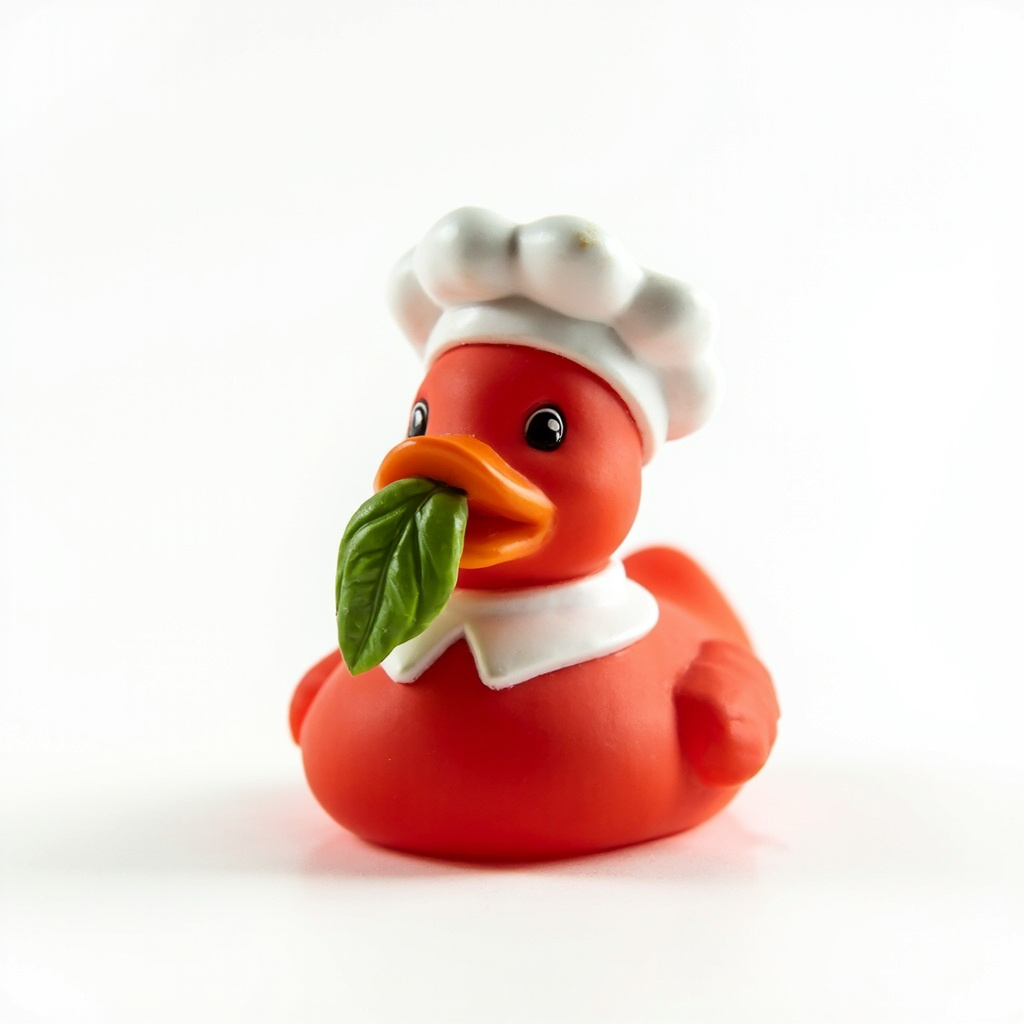
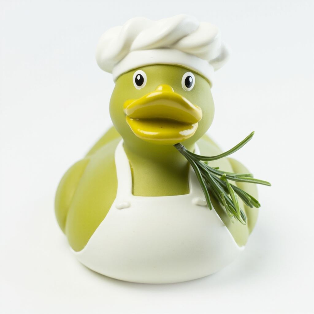
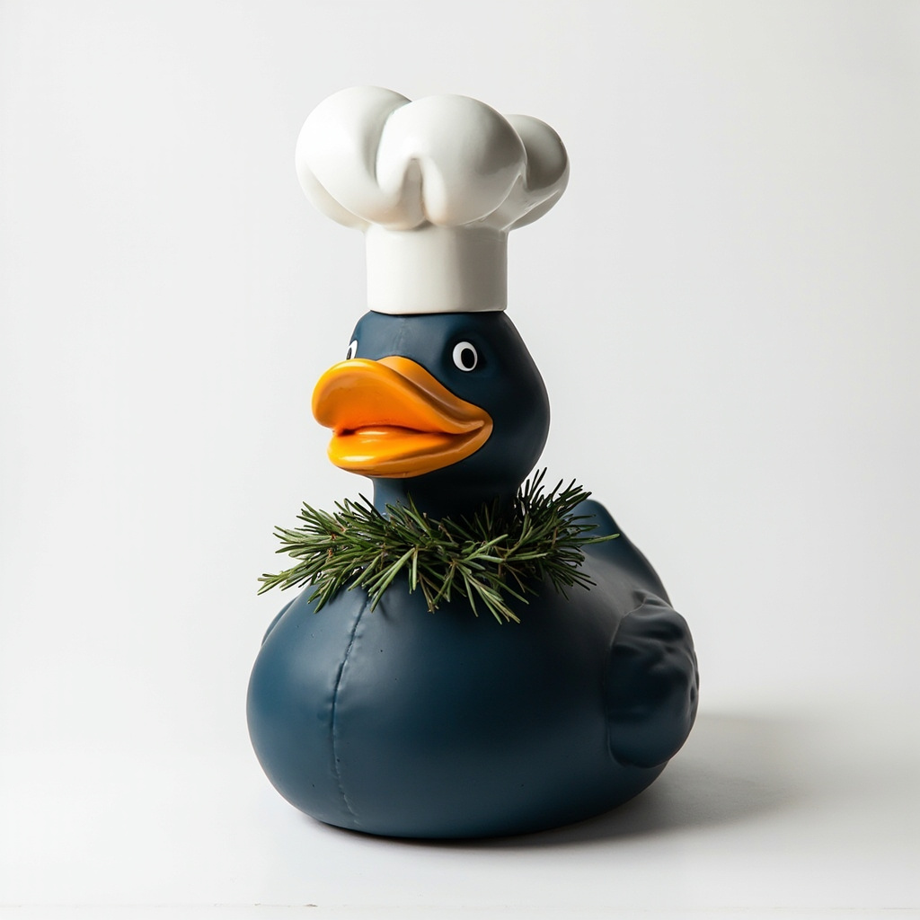
Every Quackery duck shares the same body, beak and feet — only the size, the glaze and the garnish change. Order by appetite.
A breakdown of the typographic, chromatic and compositional decisions that turn a duck into a dish.
Editorial / photography-led. Each duck is staged like a magazine spread — generous whitespace inside the card, props (basil, cucumber, sauce) play supporting roles, never props-as-decoration.
Peach #E8B5A8 → beige #C8B59A gradient grounds the palette. Card surface lifts to #E8D5C0. Tomato-red, yolk-orange and basil-green accents live inside the photograph — never on chrome.
Inter for the UI: 700 for the title and price, 500 for labels, 400 for body. Display sizes use a tight −0.02em letter-spacing. Everything else holds to 12–14px.
Full-bleed image with the card's rounded corner clipping the photograph. The hero mass is the single most saturated thing on screen, so the rest of the UI can stay calm.
Tap the side phone to swap the main hero — the catalog is right there, not in a separate route. The cart badge counts, the heart toggles, the CTA scales on hover.
The heart and CTA must keep a 12px tap-target gap. Body copy caps at two lines before it pushes the price row down. Don't tint the chrome to match the bowl rim — they share a value range.
Each Quackery duck is hand-glazed in a single firing and served on a numbered ceramic plate. No shrink-wrap. No mailer box. Just a duck, a plate, and a recipe card.